


The Making Of "Pyro"
In this tutorial, I will reveal my process for drawing and painting 'Pyro', a recent personal character illustration I completed inspired by mythology. Of course, there are many ways to draw and paint digitally, so don't be afraid to adopt the techniques discussed here with your own way of working.
I will be using Photoshop and a Wacom Intuos Pro tablet to draw and paint the illustration, which is how I've been working for years now. Alternatively, other digital painting programs should work just as well, including an iPad Pro with Procreate. With that said, let's begin!
Preliminary Step: Inspiration and Reference Material
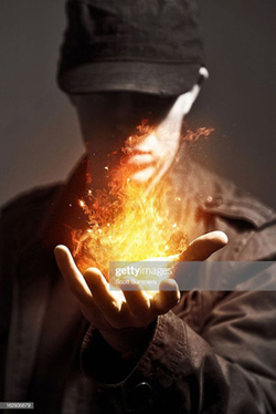
If your goal is to paint something very believable, I highly recommend studying reference material (unless of course, you're one of the lucky few who have a photographic memory). A useful resource for reference gathering and inspiration is Pinterest; In fact this whole concept came up when I discovered an image of hand holding a flame, and that made my imagination run wild and thought of a more fantastical theme for the character.
Although we will be using a reference, you don't necessarily need to be a slave to it. For example, don't be afraid to illustrate your own character designs or faces/ethnicity, etc. What you should be looking for in regards to a good reference is dynamic poses and lighting.
Now that we have the inspiration for the image, it's time for the fun part; to begin the drawing!
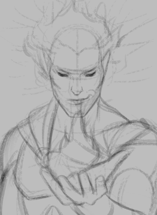
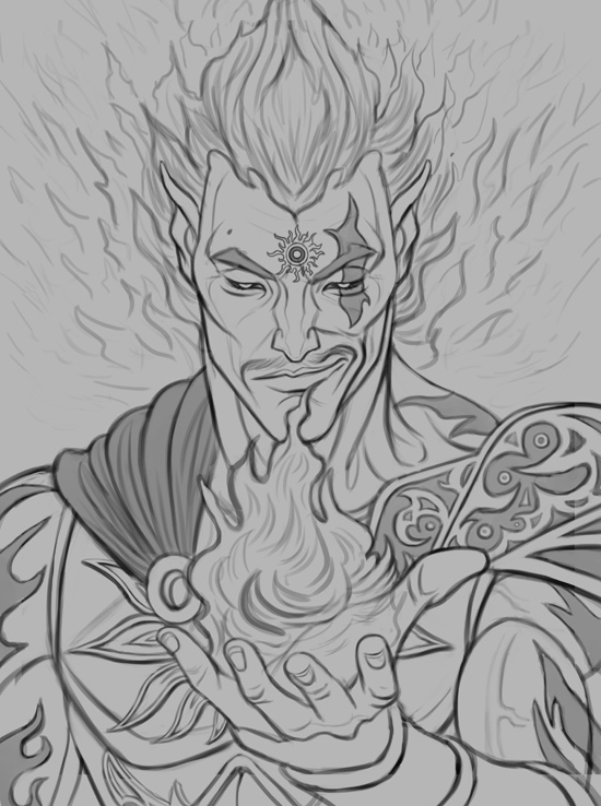
STEP 1: Rough Sketch
First, create a new document in high resolution, preferably at 300 DPI. I'm working on roughly U.S. Paper Size here, which is great for a portrait illustration. Those dimensions are roughly 8.5 x 11 inches. I use a light gray color for the background.
In regards to brushes, I recently adopted a technique of using a rough, textured pencil brush for the rough sketching phase. The pros to using this sort of brush is that due to its texture, it helps you to think in simpler terms and avoid unnecessary detail. This helped loosen up my style significantly. The exact brush I used was purchased from Jens Claessens Gumroad page, which offers some great brushes with a traditional feel for a great price, so I highly recommend them. You can purchase his brushes here.
Once I select the pencil brush, I pick a pure black color (RGB set to 0 0 0 on the 'Color Box' in Photoshop), with the opacity of the brush set very low - anywhere from 15-25% would be ideal.
I start by creating a new layer and drawing in the head starting with a circle. I want him looking down toward the flame, so I draw a gesture line to represent this. Next I draw another gesture line that splits his face in half, as I want it fairly symmetrical.
The exact method I use for drawing heads is based on Andrew Loomis 'Drawing The Head and Hands' book, and he does an incredible job of explaining his technique. I highly recommend beginners to study his work, especially for heads as it's pretty much the standard method used for illustrating heads and hands.
Try to think in simple forms and gestures on your initial rough sketches. This makes things easier to draw and gives you a more believable result. Once we have the basic rough sketch down, it's time to tighten it up!
STEP 2: Refining The Sketch
Now that we have a decent rough sketch in place, it's time to refine it heavily using a Hard Edged Brush. Using this brush is great to develop very crisp and clear line work.
In Photoshop, I choose a hard edged brush with 'hardness' set to 100%, Size Jitter Set to: Pen Pressure and Opacity set to 'Pen Pressure' as well in the 'Brush Settings' menu.
Similar to the previous step, we will select a pure black color with a low opacity (in this case, anywhere from 20-30% opacity would be ideal).
Firstly, lower the opacity of the 'rough sketch' layer down to 30%, and then create a new layer which will be the refined sketch. Draw over the rough sketch carefully, looking at reference as a guide if needed. I also experiment with some designs for the armors and such throughout this phase as well. Work slowly and carefully at this stage!
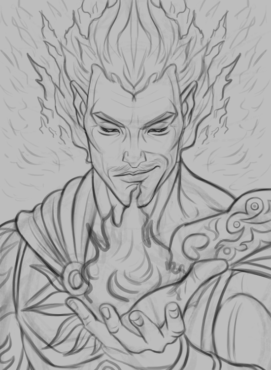
STEP 3: Finalizing the Refined Sketch
I'm happy with how the sketch is turning out, but I want to give it that extra push in terms of detailing and line weight, so I create another layer to try out different tattoo and armor designs and then merge it when I'm happy with the results. I also want to push line weight a bit further to give it a more professional finish, so I simply draw over the lines I already have to give some of them a bolder look. I use a higher opacity to add line weight, anywhere from 30-40% would be ideal. You don't necessarily have to push line weight too far if you're planning on painting the drawing in, but having a highly polished sketch gives me more confidence during the painting process, so I chose to take my time with it.
Once you're happy with the fine line work, you can feel free to delete the 'rough' sketch you used as a guide, as it's no longer needed.
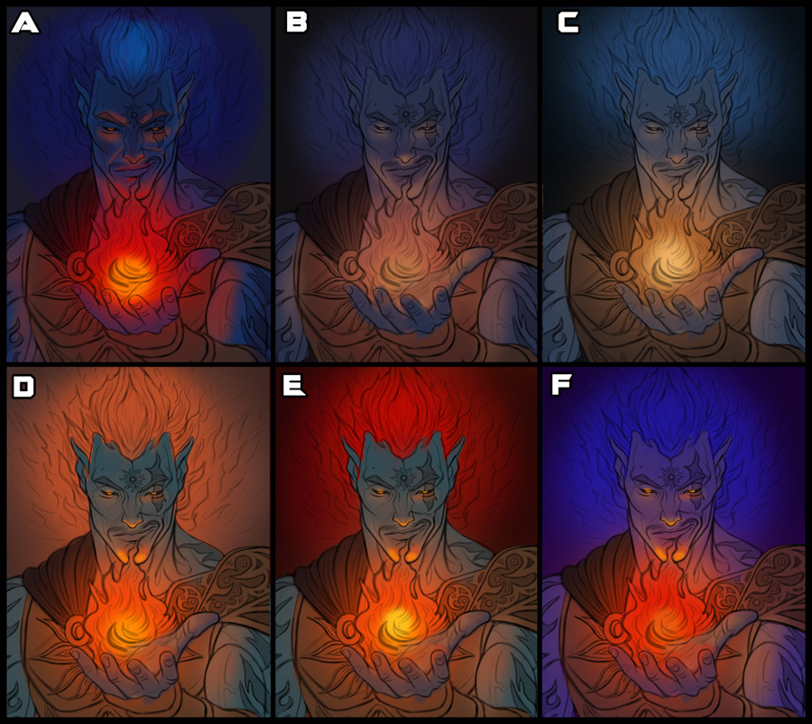
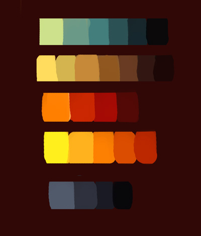
STEP 4: Color Tests
For this step we will be trying out different color themes so we can have some options to choose from on what works best. You should work fairly fast at this stage, as we're simply going to be focusing on some quick colors and basic shading, nothing too detailed! Be as loose as possible here and don't be afraid to try out wildly different color themes and lighting if necessary. Work with a very limited (if any at all) number of layers. I also recommend working with fairly large brushes as well.
Save each color test as a separate file, and finally put them all together so you can easily compare them side by side. This will give you a much better idea of what works best. I also asked the input of some fellow artists and friends in regards to what they thought worked best.
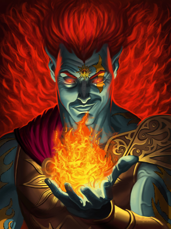
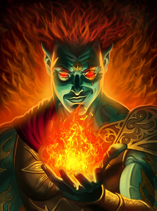
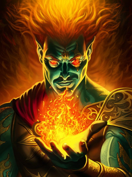
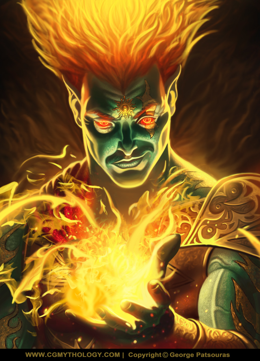
The general consensus was that the 'blue' theme color tests were too reminiscent of 'Hades', and that the warmer tests gave off a sun/fire feeling better, which I definitely agreed upon. Taking that into consideration, I chose to go with version 'E'
STEP 5: Flat Colors
Now that we have a color theme in mind, it's time for the basic block in stage! Here we will block out the local colors for separate elements on the illustration, preferably with layers and name them accordingly. There will be no shading at all in this step, just basic flat colors to get things looking as clean as possible.
Do not rush this stage! It looks simple but great care must be given here as this will make the painting process much easier, so feel free to take your time. Once you're happy with the base colors, we will next create a detailed color palette!
STEP 6: Creating a Color Palette
Now that we have the local colors in place, we will create a color palette in a new document to pick out the colors and tones for the shading process. Create a new document in Photoshop and fill it with a dark color by sampling a color from the background layer of the previous step. Next, create a new layer and name it 'Color Palette'. Now, select each color from the previous step using Photoshop's 'Color Picker tool'. Color Drop each base tone from each element (example, the color/hue of the skin, the 'gold armor' and the 'tattoos').
Once that's done, we will chose highlights and shadows for each element using Photoshop's 'Color Box' tool. Really think about the colors you want to use here. Since the image will be lit by the flame, the highlights should gear towards a bright yellowish tone. Likewise, the shadows should reflect a dark reddish tone from the background. Below is my initial color palette for this illustration:
STEP 7: Adding Shadows and Highlights
Now that we know what colors to use, we will be applying shadows and highlights throughout the image. Always keep in mind your light source, and feel free to use the rough 'color test' we completed previously to use as a guide for lighting. Keep your brush usage simple, and do not be concerned about blending or detail work at this stage. We're looking only to block out the larger forms here. If you're a beginning artist, I recommend you use a larger brush than what you might initially go with just to keep you in that habit of avoiding detail work.
STEP 8: Taking It A Step Further
Now that we've established lighting, let's continue adding deeper shadows and brighter highlights using the color palette we recently created. Always keep in mind your light source and place your shadows/highlights accordingly. At this stage I'm still using a hard edged brush and avoid major detail work.
I pay special care to the face; I'm going for an ominous look here, so I chose to light it accordingly. This lighting is difficult as it's the most unnatural one you can choose, so I quickly check some reference material with the lighting I'd like to incorporate:
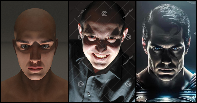
Don't be too concerned about capturing a likeness here, that is not the goal; The goal is to apply the lighting the face we've already established, so take special notes of where the forms of where the shadows and highlights are placed on the reference material, and do your best to apply it to your own illustration.
After working on the face, I also define the background more a bit more. I want a fire-ish look to the background, so I paint some 'flame-like' strokes in. I also want to blend the flames with his 'hair' somewhat, so I keep that in mind when painting. I'm using hard edged brushes mostly in this stage as well.
STEP 9: Blending and Refinements
I don't like the tattoos being so dark, as it doesn't compliment the figures skin tone well. I decide to change it to a brighter golden color to compliment the figure's armor... it feels more consistent this way. At this stage, I also begin smoothing out the skin by using a custom blending brush set to 50% Opacity. You can use a variety of brushes for blending. An excellent choice for blending is also a soft airbrush with a relatively low opacity (around 25%-40% would be ideal).
I also add a rim light on the figure to help him pop out of the background more. Next, I begin experiment with textured brushes to give the 'flame' a more natural look.
STEP 10: Refinement and Color Changes
At this stage I feel the color palette can be improved somewhat. I feel the backgrounds highly saturated red tones pop too much, so I chose to incorporate more darker, yellowish tones. To do this quickly in Photoshop, I simply selecting 'Image > Adjustments > Hue/Saturation' and experiment with it a bit until I get the result that's most appealing.
To help make the skin tones of the character pop out more, I use Photoshop's 'Color Balance' Tool as well (Image > Adjustments > Color Balance) and give it a more Green-ish hue.
I also resume detailing the image throughout, trying my best to give the same amount of detail to each element (face, hand, armor, flame, etc) for consistency. I experiment with different custom textured brushes for the 'flame' as well to bring out the texture and details more.
STEP 11: More Detail and Refinement
At this stage it's coming together quite well I'd say, so I flatten all the layers and focus on giving the image a more refined, professional look. I continue to refine the image using smaller brushes (both hard edged and soft edged are used) to bring out the details more. To make the image more dynamic, I add a soft 'glow' or light coming from the top of the image on the figure's 'hair'... sort of giving an impression of a 'flame' which is intentional and suits the subject matter quite well.
I also define the edges of the figure more (where the rim light is) as those got a bit too blurry during the previous step. I'm zooming on on the image significantly here to handle the details and refinement, which just makes things easier on my end. At this point the image is almost finalized!
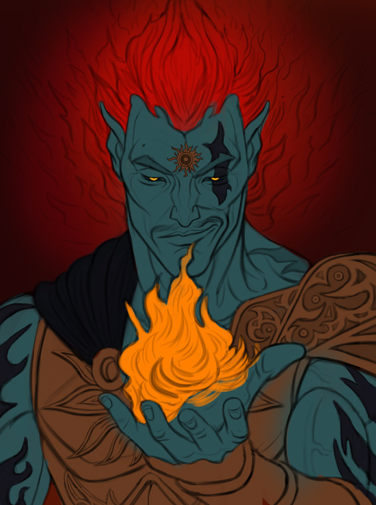
STEP 12: Feedback and Final Refinements
Once I'm happy with the image, I send it to some friends and fellow artists for their input, and to see what can be improved or simply doesn't work. This step is important and greatly improved my ability as an artist, so don't be afraid to ask for feedback from friends and other artists!
The general feedback was that the darks are a bit too dark, and the thumb was too large. Luckily I can easily fix the first issue with Photoshop's excellent 'Levels' tool (Image > Adjustments > Levels).
As for the thumb, that was a bit more tricky as I have 'flattened' the image at this stage so it's no longer in it's own layer, so I simply select the lasso tool to edit the size of the thumb. This left a few small errors which I quickly fixed by painting them in.
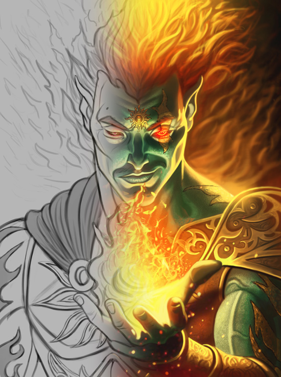
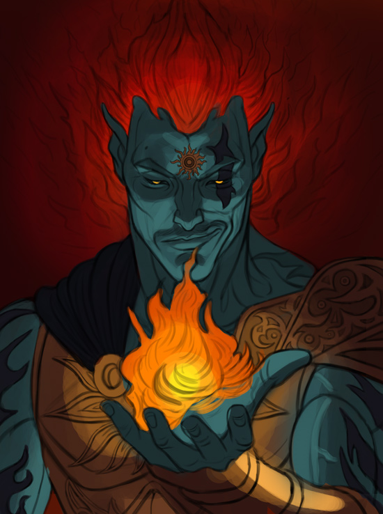
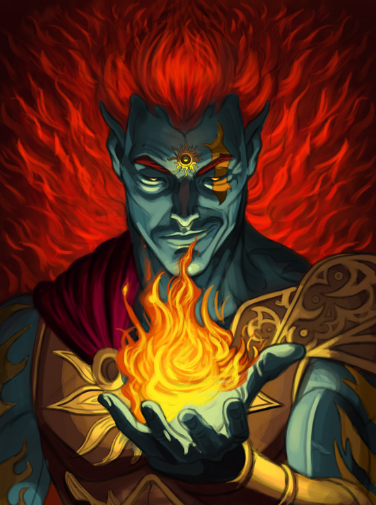
I'm satisfied with the image now and it's come to a close. Below is the completed illustration:
FINAL THOUGHTS
I hope you found this tutorial useful! Later this year I will be recording a Video Tutorial as well, which will also be completely free, so you can get a better understanding of my process. Don't be too concerned about following the techniques I've established her too faithfully. All artists have a unique way of working, so it's best to just experiment and apply what works best for you and your style. With that said, feel free to e-mail me for any questions in regards to digital painting or otherwise, as I'd be more than happy to help!
Back to the Top
Back To Tutorials